
Rocketbird
Launched in San Francisco and poised to circle the globe, Rocketbird is a new brand champion for the previously humble chicken sandwich. Rocketbird is branded whimsically, yet with serious attention to how it's crafted meticulously, cooked deliciously, packaged sustainably, ordered digitally, and delivered swiftly.
The Name of the Game
A fun new name says it all. It’s fast. It’s bold. It’s chicken. It lands in your hand in a flash, lights up your taste buds like a roman candle, and leaves you humming that old Elton John rocket song until next time you meet (it will feel like a long, long time).


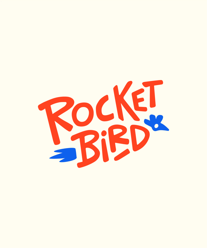

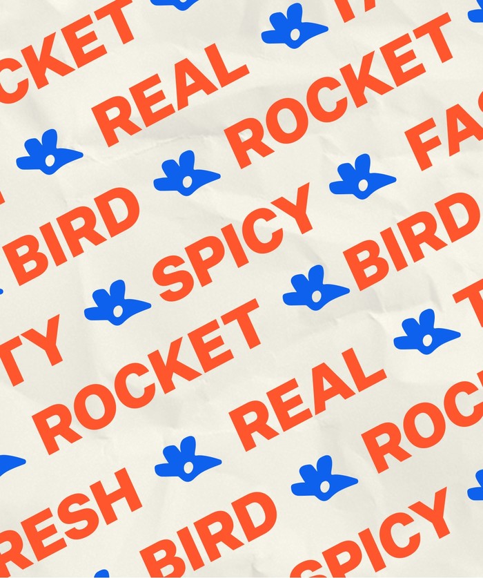
Definitely Not a Samewich
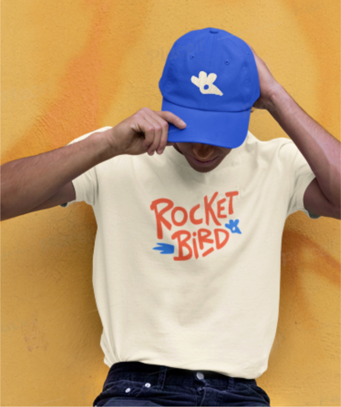
Hand-drawn rocket fire, bird head, and playful typeface are the key elements of the endearingly quirky identity. The primary color palette defies old, expected red-yellow chicken signals. It’s a visual identity with the digital curb appeal to stand out from the long scroll of brands in your delivery app, then bring a smile to your door. And make you want to tack a t-shirt and ball cap onto your next order.
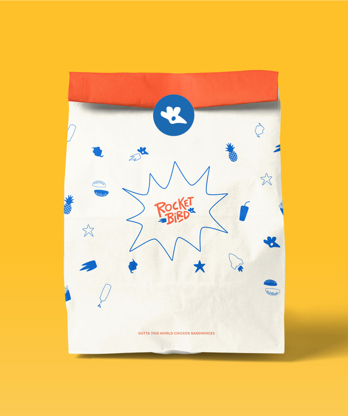
A Packaging Player
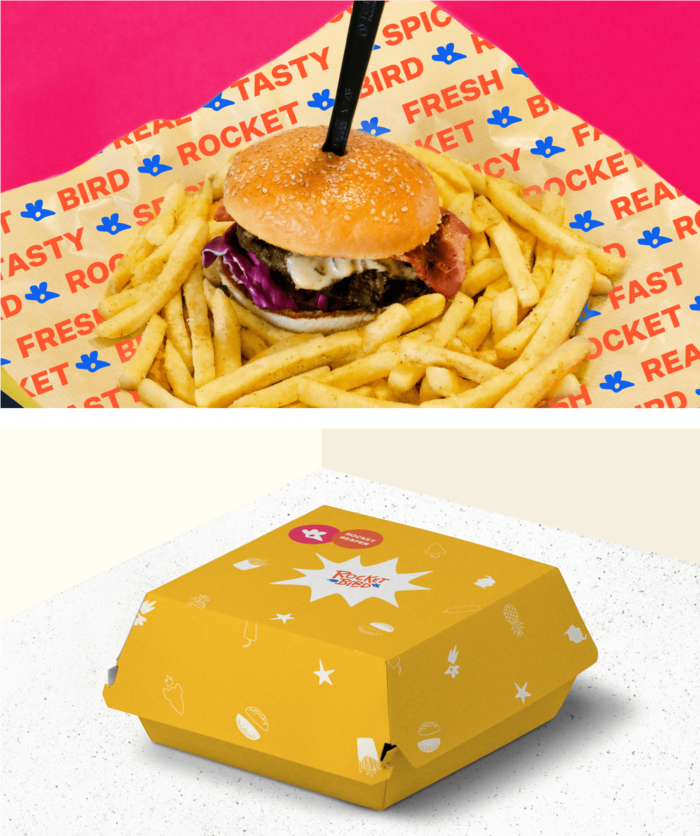
Packaging delivers the whole package for the delectable new food brand. While expressing the fun Rocketbird vibe, it's produced with quality, sustainable ingredients like recyclable materials and soy inks. Vibrant, varied colorways make each delivery an invitation to enthused social media sharing. As identity plays out, Rocketbird schwag shows the versatility to extend into staff uniforms.
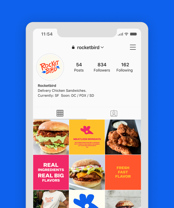
Rocketbird's Digital Liftoff
Online, hand-drawn illustrations animate to life on all your mobile and desktop browsers and devices, helping to guide you through the food delivery menu. On desktop, your cursor even becomes its own Rocketbird. Easy ordering and integrated social media feeds complete the new website design.


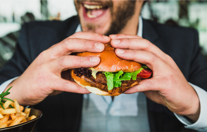
Images That Draw You In
An eye-catching photography style helps Rocketbird standout from the sandwich crowd. Bold background colors and bright, illustrated packaging set the tone. First-person perspective helps connect you to the real possibility of Rocketbird in your near future. Especially those closeups with hands holding up a delicious sandwich as though you're pulling it out of the screen right into your sandwich-eating face. Maybe someday.


The new Rocketbird brand is the meat between the collaborative sandwich of Laura Lyons and Thomas Kelleher on one side, and FINE's creative agency team on the other.