
McKibbon
For 8+ decades, McKibbon Hospitality has developed, owned, and managed properties alongside some of the world’s largest hoteliers. As its market cluttered with new corporate competitors, a move to significantly update and elevate the essence of a brand 80 years in the making began. While a major overhaul of visual and verbal cues followed, our agency helped the core brand emerge as more true than ever, revolving around people who make hospitality happen.
Brand Foundation / People are the Platform
At its core, McKibbon exhibits a rebellious willingness to be completely “employee focused” and people-minded in a sea of B2B-minded competitors. It’s a belief that happy employees correlate to the desired end benefit of all their collaborations — happy guests. That’s both the foundation and building blocks for a newly documented brand story, brand platform, and positioning. It's employer branding made public, summarized in their new battle cry, “Hospitality Begins With Us.”

Flipping the Brand Script
The core brand approach drives the sense that the identity’s power comes from the personal interactions it enables. A simple, understated mark re-emphasized the word “Hospitality” and plays with the word. On business cards, the phrase “Hospitality Begins with Me” flips to face the employee each time it’s used, serving as an affirmation and reminder that hospitality is, quite literally, reflected in everything they do.

Stamp of Approval
The core logo treatment plays out across a strong but simple visual standard that makes it easy to sustain consistency. A secondary short-form mark, pairing the M and H, becomes a monogram-like visual suitable for visual environments from environmental to good old-fashioned schwag. It’s a sophisticated graphical treatment with a familiar feel.
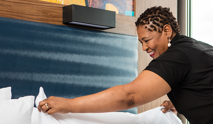
People Front and Center
With a focus on people permeating the brand, a portrait imagery style was established. Framed by simple and sophisticated graphic standards, photography is less staged, more candid, and frankly easier to produce — from collateral through to the website.
Website Redesign / Digital Renovation
The new McKibbon website design establishes perhaps the most-comprehensive introduction to new business and future employees, while conveying McKibbon's leadership position in start-to-finish hospitality that all people can rally around. A minimal fly-out nav, bold imagery grids, and color blocks set the tone. The warm, people-first approach emerges in imagery, video, and quotes on almost every page. Stats and team pages back it all up, across all digital devices.
Company Convention / The Main Event
A major brand touchpoint is the company’s annual “convention” — a gathering of the very people who make and inspire the brand. A new name — McKibbon One — and a design that establishes consistency rather than requiring visual and thematic variations each time, allows the event to become a mainstay for years to come.
“80 years later, FINE came along and helped us show and tell a story that’s been unfolding since the day we started.”